Back to Projects
Spotify Light Mode
Design system case study — [2024]
Role:
Product Designer (Design System)
Date:
2024
Team:
Xiomara Pannella & Samantha Nguyen
Overview
Design system case study (Memorisely bootcamp)
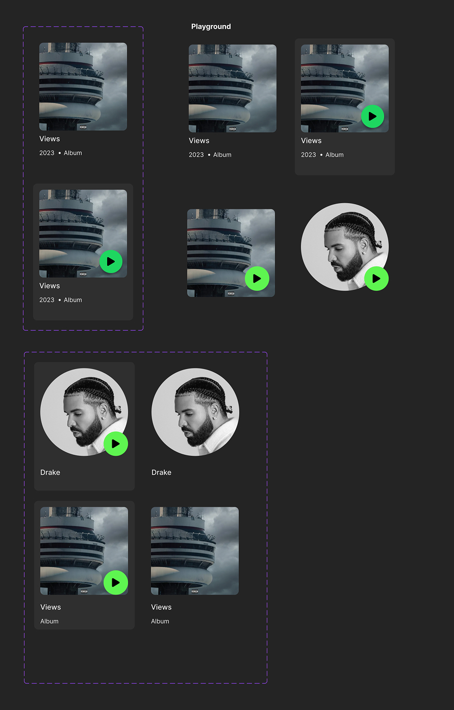
Project Images
Our contributions
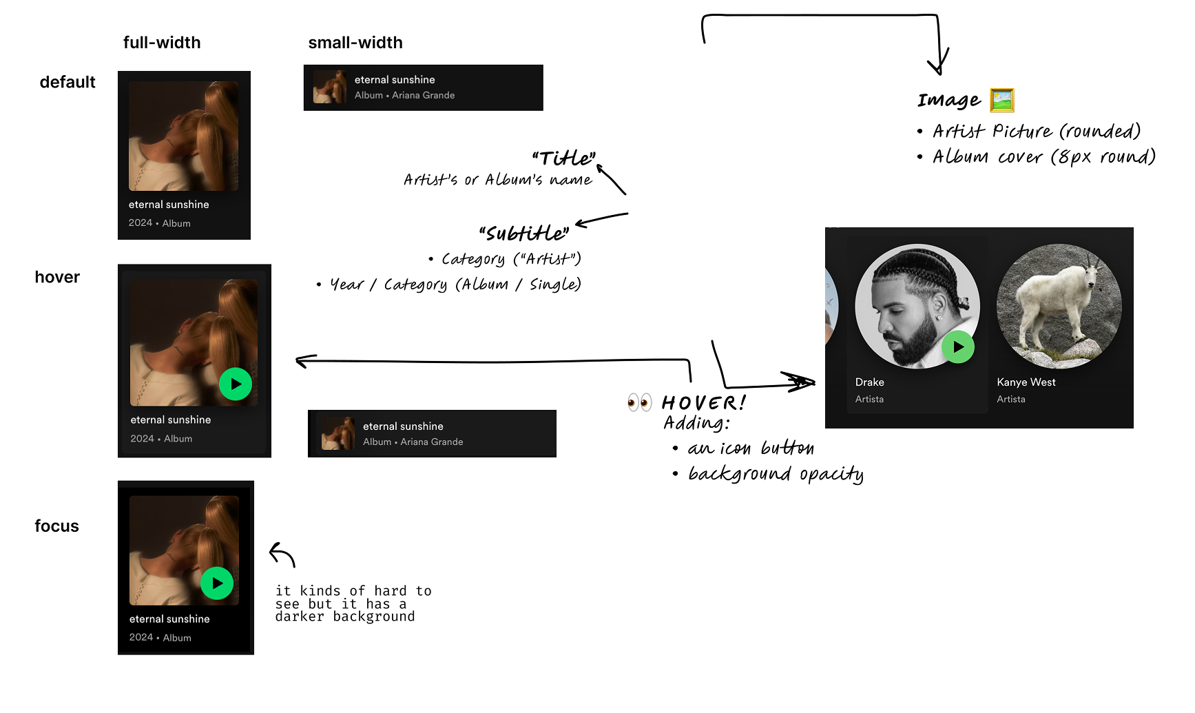
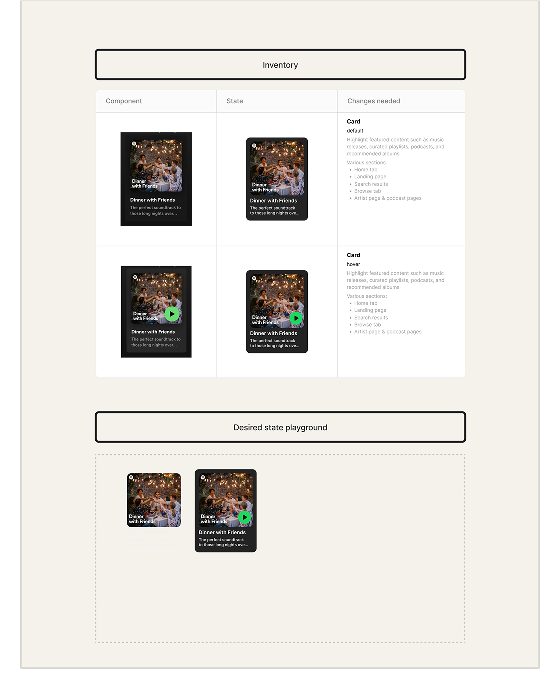
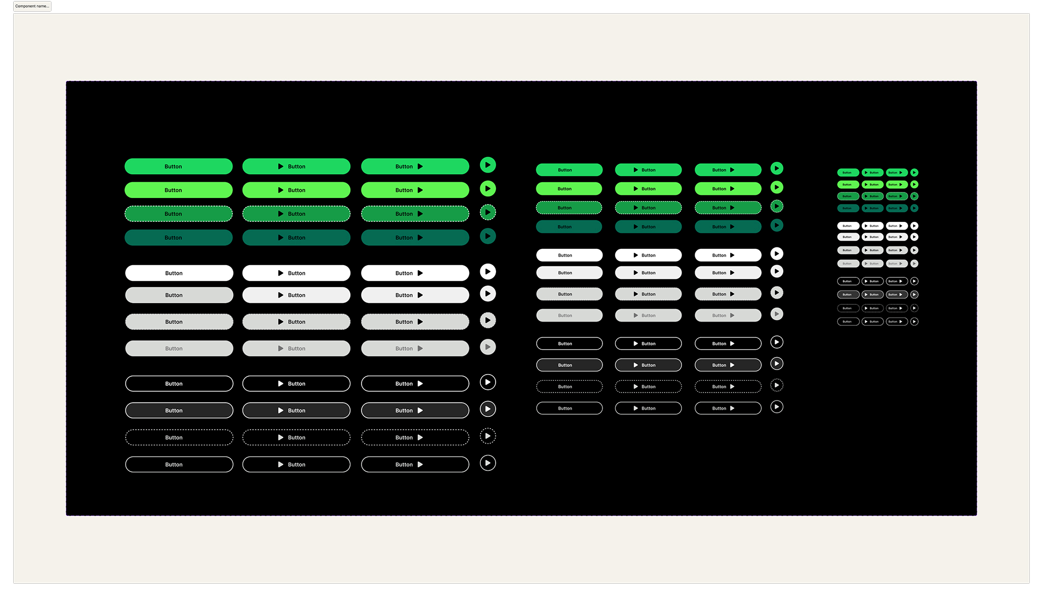
Design System foundations
- • Designed core components and UI foundations (typography, spacing, UI tokens)
- • Established a clear structure for components that could adapt seamlessly between light and dark mode
Color System analysis
- • Audited and compared Spotify's color values across web, app, and Figma
- • Identified inconsistencies in their current palette
- • Developed an expanded color scale that works consistently in both modes
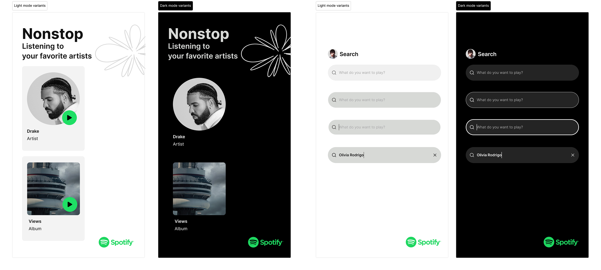
Light Mode exploration
- • Designed a conceptual light mode for Spotify, translating its dark-first visual identity into a brighter environment
- • Reworked components, icons, and surfaces to preserve brand feel while ensuring readability and contrast
- • Documented how components behave, invert, or adapt across modes
Outcome
A set of component explorations and application views built using Figma variables for both dark and light mode.
By defining a unified token system, our components and screens automatically adapted across modes, demonstrating how Spotify's visual language could scale consistently through a multi-theme design system.