Accessibility · Master’s thesis · Design system
Mamut Design System
An accessibility-first design system for Mamut, an app that supports caregivers (“Cuidando a quienes cuidan”). I led the research, system architecture, and UI as my master’s thesis.
Explore this project by aspect:
A token library informed by Material 3 (v1.1). Type, colour, and spacing defined once and reused everywhere.
Select a token to see where it lands on the screen.
HOY
Cuidando a quienes cuidan
Recordatorio de hoy
Medicación de la tarde, 18:00.
EmpezarSelect a token to inspect it.
Readability built into the foundations: body text ≥16px, line-height ≥1.5×, tuned letter-spacing.
Try it. Adjust size and contrast, and feel the difference the tokens make.
Hoy
Cuidando a quienes cuidan
Recordatorio: medicación de la tarde, 18:00.
EmpezarDesigned with caregivers. The people Mamut is for shaped it, not just tested it.
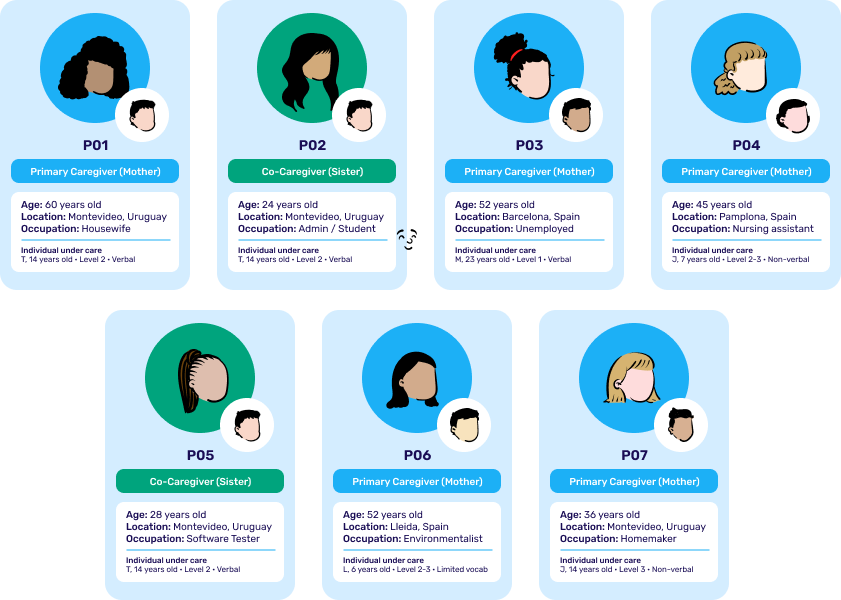
Seven caregivers took part (P01–P07): a co-design workshop, interviews with mothers and sisters of people with ASD, and low-fidelity usability testing.
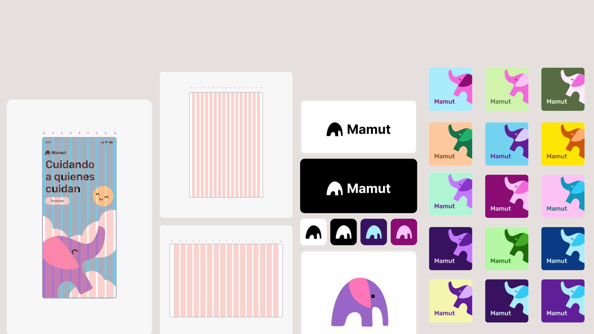
A warm, human brand for a caring app: the Mamut mammoth, a soft teal and purple palette, and a reassuring voice.
“Cuidando a quienes cuidan.” The splash sets the tone before a single task begins.

Context
Mamut, “Cuidando a quienes cuidan” (caring for those who care), supports the mental health and daily load of family caregivers, mostly mothers, of children and adolescents with autism spectrum disorder (ASD). Many live in a kind of hypervigilance: their child responds best to their voice to follow routines, so they have to stay present constantly. It’s exhausting, and their own wellbeing tends to come last. For my master’s thesis I explored how an accessibility-first, neuroinclusive design system, built on WCAG 2.2 AA plus the W3C COGA guidance, could make that daily load lighter and calmer to carry.
Participatory research
I designed with caregivers rather than for them. Seven caregivers took part (P01–P07): primary caregivers, mostly mothers, and two co-caregiver sisters, ages 24 to 60, based in Uruguay and Spain, each supporting a relative with support needs ranging from verbal to non-verbal. The research combined a co-design workshop, interviews with mothers and sisters of people with ASD, and low-fidelity usability testing with the same seven caregivers, 173 observations synthesised into 13 themes. Their needs drove decisions at the token level, not just the screen level: from how large body text had to be, to how calm the density and language needed to feel.
“Pequeñas victorias: el efecto emocional que tiene en ti misma.” Small wins: the emotional effect it has on you.
Caregiver participant, usability testing
Three things the research changed: explicit, always-visible date and time labelling, after several caregivers couldn’t tell whether a routine was for today, tomorrow, or already scheduled; voice-based routine creation kept as a core feature rather than a nice-to-have, since it was the single most-loved interaction in testing; and a protected space for the caregiver’s own wellbeing (mood check-ins, small wins), so the app supports her, not just the person she cares for.
The system
Mamut v1.1 is built as a token library, so every decision is made
once and reused everywhere. The type scale follows a Material
3 style naming convention, typography/{role}/{size},
with 16 roles, from display/large (57 / 64,
Medium) down to label/small (12 / 16). Body
sizes start at 16 px with a 1.5× line-height, and small sizes
carry extra letter-spacing for legibility. Colour and spacing are
defined as tokens on the same principle, so accessibility choices
propagate to every component automatically.
Accessibility, in practice
The proof, not the claim: the decisions encoded in the tokens, mapped to the WCAG success criteria they satisfy.
| WCAG criterion | Decision in the system |
|---|---|
| 1.4.12 Text spacing | Line-height ≥1.5× on all running text; letter-spacing tuned per Material 3 on small sizes, set in the type tokens. |
| 1.4.4 Resize text | Body text starts at 16 px and the scale is defined in relative roles, so it holds up when zoomed. |
| 1.4.3 / 1.4.6 Contrast | Colour tokens verified past AA, most past AAA: primary text 18.6:1 light / 16.5:1 dark (AAA target is 7:1); muted text 4.65:1 light / 6.65:1 dark (AA). |
| 2.4.7 Focus visible | Every component documents a dedicated focus-visible state alongside default, hover, active, and disabled, so keyboard focus is never left to the browser default. |
| COGA (cognitive) | Calm density, plain language, and consistent patterns, chosen for tired, stressed caregivers. |
Outcome & reflection
Mamut v1.1 stands as a reusable, accessibility-first foundation a care app can grow on, with readability and calm built into the tokens rather than retrofitted. From here, the direction I’d take it:
- A responsive web app, so it isn’t tied to one device.
- Longitudinal evaluation directly with people with ASD, not only their caregivers.
- Integrations that meet caregivers where they already are: ARASAAC pictograms, calendar sync, smart speakers, wearables.
- A path to a full build, as a public partnership (in the spirit of Uruguay’s Ceibal) or open source, with the data governance that comes with it (GDPR, Uruguay’s Law 18.331).