Design system · UI Design
Spotify light mode
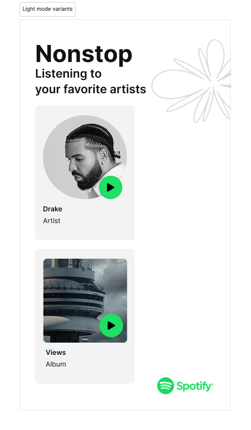
A light mode design system for Spotify, built during a UI design course with Memorisely. We rebuilt the core player screens for light while keeping every component accessible and easy to theme.
See the system switch light to dark
One component set, two themes. Colour is defined once as tokens, so light and dark stay in sync and both meet contrast.
Press the button to switch the screen’s theme.
The brief
Spotify ships dark by default. Our challenge was to design a light mode that felt like the same product: same hierarchy, same warmth, same green, but readable in bright environments and accessible for people who find dark interfaces harder to read.
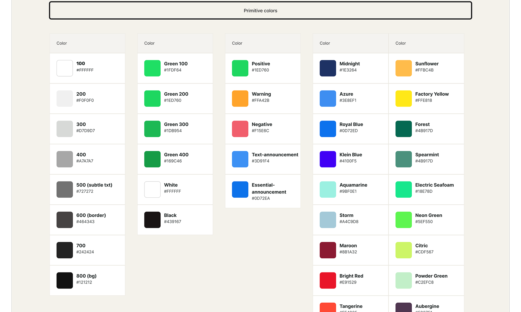
- Colors (neutral, primary, secondary)
- Dimensions
- Margins
- Paddings
- Icons
- Text
What we built
We rebuilt the core of the player as a small, themeable system: colour, type, and spacing defined as tokens, then applied across a set of reusable components so light and dark are two values of one system rather than two separate designs.
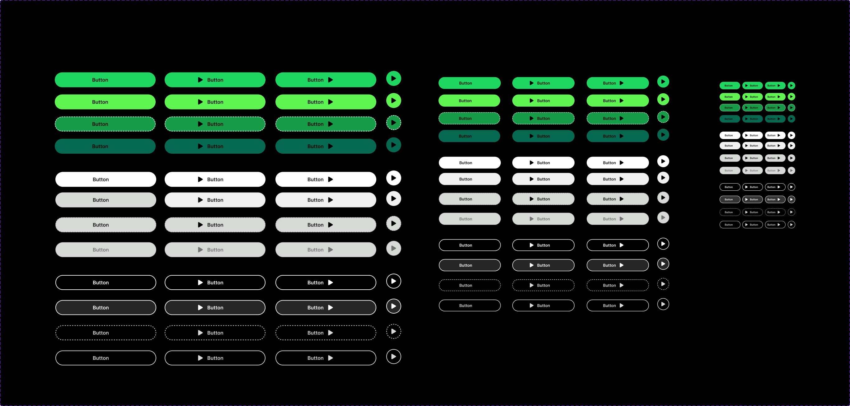
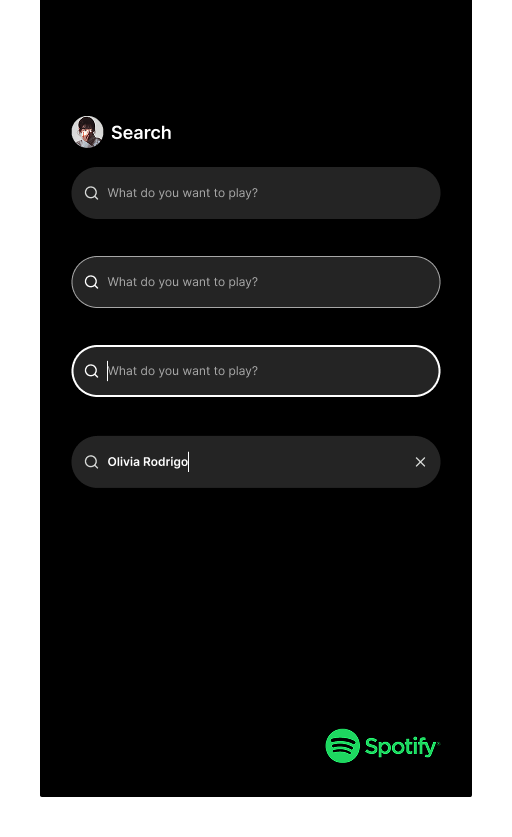
Each component was documented with its states so it could be handed off and reused.
What we did
We audited the existing dark UI, mapped every colour to a semantic token (surface, on-surface, accent), then derived a light theme from the same token names so nothing was hard-coded. We checked each pair against WCAG contrast and adjusted values that only passed in one theme.
What we learned
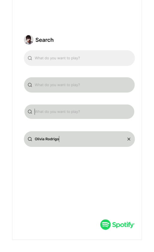
What went well: for the search bar, we managed to finish both the light and dark mode variant components successfully, and we successfully built the animation and variables behind the components.
What didn’t: distinguishing between the active, focus, and filled states. Those three were a little confusing to tell apart.
What could be improved: the way we built the cards, the logical order to do it in, and how to combine so many possibilities into just one component.